Visualize a CSV as a chart
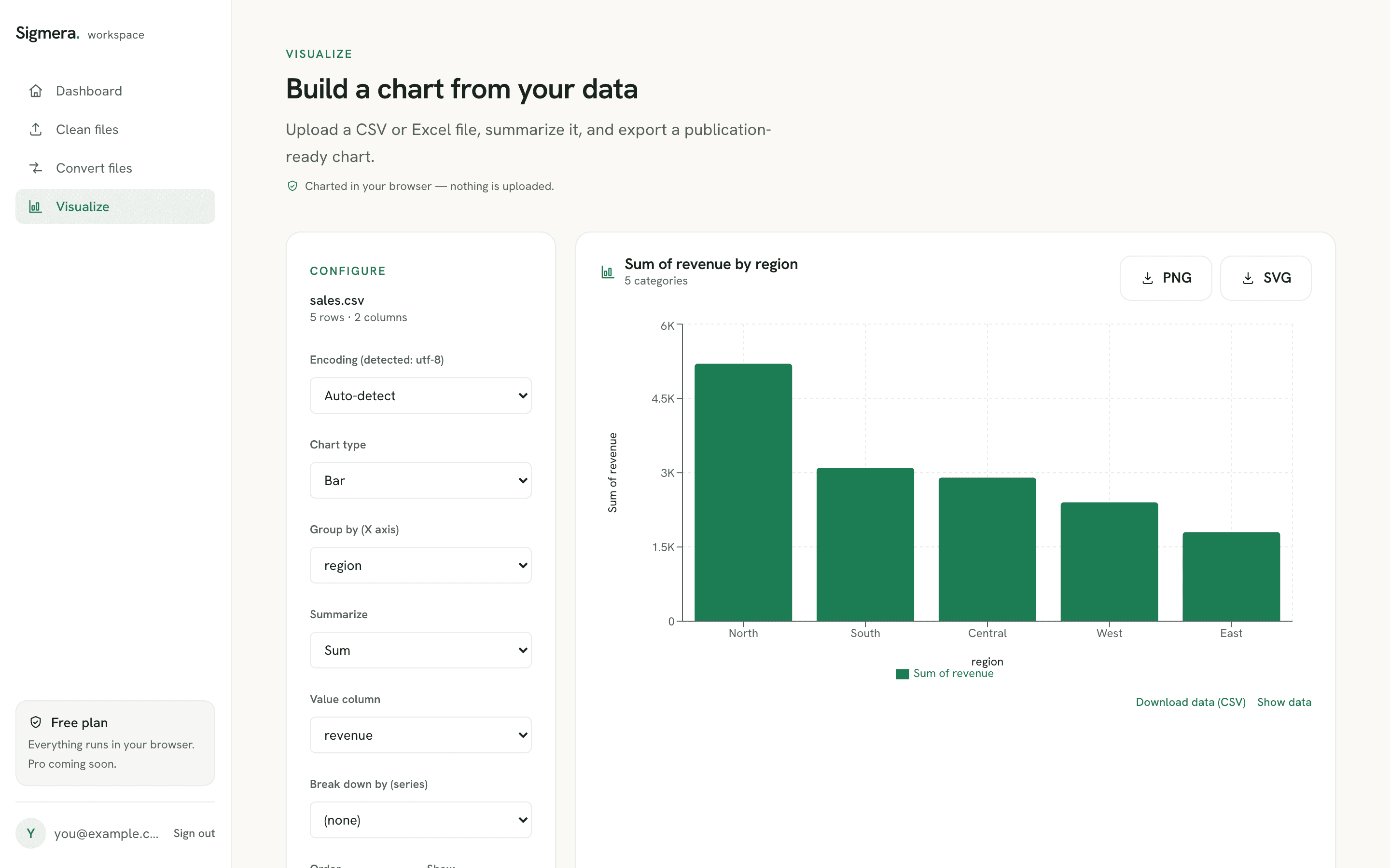
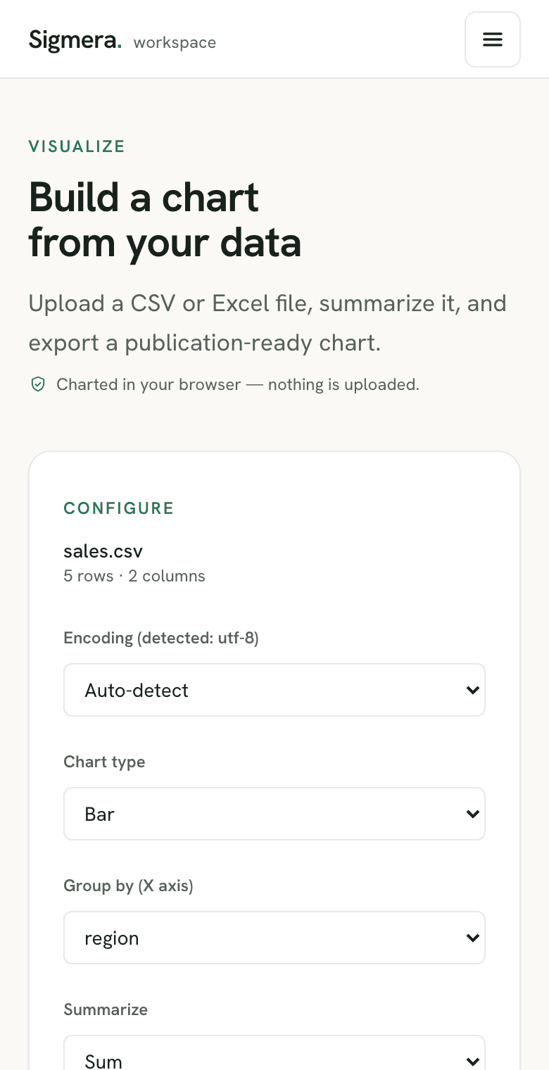
To chart a CSV, open the chart builder in Sigmera, pick the category to group by and the value to summarize (sum, average, count and more), choose a bar, line, area or pie chart, and export a PNG or SVG. It all happens in your browser — your data is never uploaded to a server, so it’s GDPR-safe by design.
Last updated: June 2026
Use the chart builder free in your workspace
Free account, no credit card — every tool, unlimited rows, 3 free downloads a month, nothing uploaded.
🔒 Everything runs in your browser — your file is never uploaded, and the workspace even works offline once it has loaded.
How to make a chart from a CSV
- 1. Open the chart builder in your free workspace. Your file is read into the browser’s memory — never sent over the network.
- 2. Group and summarize. Pick the category column for the X axis and how to summarize the value — sum, average, count, min, or max — optionally split into series.
- 3. Choose a chart type. Switch between bar, line, area, and pie and watch it update live.
- 4. Export the image. Download a PNG or SVG with your title and data baked in.
Frequently asked questions
- Does this tool upload my data?
- No. The chart is built entirely inside your web browser using client-side JavaScript. Your file is never uploaded to a server, so it is GDPR-safe by design.
- What chart types are supported?
- Bar, line, area, and pie. You group by a category column and summarize a value column with Sum, Average, Count, Minimum, or Maximum — and you can break the data down into multiple series.
- Can I export the chart?
- Yes. You can export the chart as a PNG (for slides and docs) or an SVG (for crisp, editable vector graphics), with the title and your data baked in.
- Does it work with Excel files too?
- Yes. You can chart a .csv, .tsv, .xlsx or .xls file. Sigmera auto-detects the encoding and lets you pick the sheet for multi-tab workbooks.